Tuesday, 20 December 2011

What is ISO?


In film photography ISO indicated how sensitive a film was to light. The lower the number seen on the film (100,200,400 etc) the lower the sensitivity of the film and the finer the grain in the images produced.
In Digital Photography ISO measures the sensitivity of the image sensor. The same applies here, the lower the number the less sensitive your camera is to light and the finer the grain. Higher ISO settings are usually used in darker situations to get faster shutter speeds but the shots will appear “noisier”.
ISO Speed & Exposure
ISO speed affects the shutter speed/aperture combinations you can use to obtain correct exposure.
If your camera warns you that there is not enough light to correctly expose an image and you are unable to use your flash then you would need to use a higher ISO. Using ISO Auto mode, the digital camera will automatically select a higher ISO. Or, you can manually select the next higher ISO and see if the increased sensitivity allows you to achieve a correctly exposed picture.
Equally, if you find the camera is using a shutter speed that is too slow to hold the camera steady (you have no tripod), you cannot open the aperture anymore etc then you can select the next higher ISO which will then allow you to select a faster shutter speed.
ISO Speed and Noise.
The increase in sensitivity will however cause your image to appear more noisy.
When you boost the sensitivity of the image sensor by selecting a higher ISO, it can now record a fainter light signal. However, it will also record fainter noise (noise is any signal that is not attributed to the light from your subject). The increased sensitivity allows the image sensor to record more light signal as well as more noise. The ratio of light signal to noise (S/N ratio) determines the noise in your image. Noise produced by an image sensor appears as off-putting coloured dots on your photo.
An image sensor is usually calibrated so that it gives the best image quality (greatest S/N ratio) at its lowest ISO speed.
ISO Speed and Image Sensor size.
The size of the image sensor determines the ISO speed range that a digital camera can use without displaying excessive noise. The pixels on the larger image sensor can be larger and therefore receive more light, and therefore have a greater signal-to-noise (S/N) ratio.
Things to consider:
  • You can achieve the best image quality by using the lowest ISO possible on your digital camera
  • If you mostly take pictures where there is enough light for a correct exposure, i.e. sunny outdoors, then using the lowest ISO on your digital camera will give you the best image quality your digital camera is capable of.
  • If you want to take pictures indoors where light may not be sufficient and in other low-light situations, then you would need to supplement existing light with flash or studio lights or select a higher ISO (which may result in a noisier image)
  • A large image sensor means that you are able to use a high ISO speed without worrying too much about noise. This means that you can take pictures in low-light situations without your pictures being under-exposed. It also means that in situations where it is required, you are able to use a fast enough shutter speed to prevent camera shake. All, again depending on your camera, without much noise.

Info from:
Nikon D90 manual.
Wikipedia


Sunday, 18 December 2011

The photographers' art of capturing what they see.


I feel that this article in The Guardian ties in with the article I had previously read on photoshopping. I understand that to a certain extent images should appear artistic and aesthetically pleasing but they should also be a realistic account of what the photographer has viewed. Images can be seen to be misleading if 'wrongly' edited and I believe that whilst trying to produce an attractive image, photographer's should try to be careful that the photo does not stray to far from the original.


Sunday, 11 December 2011

Exercise: Primary and secondary colours.

For this exercise we are to find scenes or parts of scenes which are dominated by one of the primary and secondary colours. With each colour that we find we then have to vary the exposure slightly. Our first photo should be taken as the meter reading indicates, the second 1/2 a stop brighter and the third 1/2 a stop darker. our next job is to then select the photo that matches most closely to the colour wheel.

I first had to change the setting of my camera so that I could make the 1/2 stop adjustments as it has a default of 1/3 stop. This exercise is taking me quite a while to complete. My first problem has been the light as I do shift work and there is only a small window of "good" light available in the day and have therefore taken all of my shots using the built in flash. I have also struggled a bit with finding objects that have the desired colour. This has meant that some of my photos taken have been quite staged rather than me coming across them out and about.

Thinking about the point of the exercise and my expected outcome, I think that I will find that the slight underexposed shots will match the colour wheel most closely.


I think that it is important to note that colours in photography can appear different when placed next to other colours.


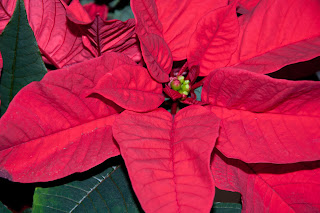
Red.

"Red is visually one of the most insistent, powerful colours, and immediately attracts attention"


1/200s f8 ISO 200 105mm +0.5 EV


1/200s f8 ISO 200 105mm Metered exposure.


1/200s f8 ISO 200 105mm -0.5 EV


The slightly underexposed example matches the colour wheel the closest.


Orange.

"Orange is the mixture of yellow and red and absorbs some of the qualities of both. it is brilliant and powerful when pure."


1/200s f8 ISO 200 105mm +0.5EV


1/200s f8 ISO 200 105mm Metered exposure


1/200s f8 ISO 200 105 mm -0.5 EV

I also think that by comparing the colour of the orange peel, the underexposed image again matches the best.


Yellow.

"Expressively, yellow is vigorous and sharp, the opposite of placid and restful".


1/200s f8 ISO 200 105mm +0.5 EV


1/200s f8 ISO 200 105mm Metered exposure.


1/200s f8 ISO 200 105mm -0.5 EV

Remaining consistent here, the underexposed is closest but still no where near the colour wheel really. it is not bright and vibrant enough to really match.
I then decided to change what I was photography and have instead gone for a yellow pepper as it already looks closer in colour to the colour wheel.


1/200s f8 ISO 200 105mm +0.5 EV


1/200s f8 ISO 200 105mm Metered exposure.


1/200s f8 ISO 200 105mm -0.5 EV

I feel that the pepper has been much more successful and I actually feel that the more overexposed image is closer in colour to the colour wheel example.

Green.

"Green is the colour of growth".

I found green probably the hardest to photograph as there are just so many different shades of green. Also with it being Winter now it has been hard to find just the right green. I have had to settle for using some grass/moss. I felt that I was in a bit more of a rush shooting this colour as I really had to pick my time, we have had so much rain and some snow plus the light has been awful.


1/200s f8 ISO 200 105mm +0.5 EV


1/200s f8 ISO 200 105mm Metered exposure.


1/200s f8 ISO 200 105mm -0.5 EV

The underexposed shot is probably the closest but as there are so many shades of green in the image it is rather hard to assess. If shooting this colour again I would probably pick a closer match to the wheel in the first place, and also pick something where the shade of green was more consistant.


Violet.

"It has rich and sumptuous associations but can also create an impression of mystery and immensity".


1/200s f8 ISO 200 42mm +0.5 EV


1/200s f8 ISO 200 42mm Metered exposure.


1/200s f8 ISO 200 42mm -0.5 EV

I am very disappointed with how the violet has turned out as the coat actually matches the colour wheel closely but for some reason photographing it has brought out more of a blue shade. I think that I am going to have to re shoot this one if I have time. Every item that I have found that is violet is coming out blue. and I am not entirely sure why.

Conclusion.

I have actually found it quite difficult to match the colours to the colour wheel I have been using. This exercise has however made me more aware of colours and and shades of each colour. I have also learnt that by even altering the exposure ever so slightly it can make a big difference to the colour that is then produced. Also I have really noticed how a colour can be perceived differently with a different colour background behind it. The time of year has also made me realise what a huge affect the light can have on photographing colour, particularly with the lack of it.


All quotes taken from the Basic Colour Theory course supplement.


Thursday, 8 December 2011

Deaf-blind photographer Ian Treherne in London exhibition.

I came by this article on the bbc website http://www.bbc.co.uk/news/uk-england-essex-15923449 and I have to say that it achieved what the photographer Ian Treherne wanted in the way that I felt so inspired. Treherne says that "I like to show people who take their eyesight for granted the simple views they walk past every day and do not notice." The emphasis of his work is on everyday scenes that most people tend to take for granted. He also seems to focus on the shape of his subject and finding something to appreciate the beauty in buildings/ streets/ towns.

I have been feeling a bit disheartened with my level of progression (being to hard on myself as usual) and if somebody like Ian can get on without complaint and with obvious skill then I should stop feeling sorry for myself and just get on with it, who knows what you can achieve when you put your mind to it. Ian himself hopes it shows "that with a bit of willing, passion and enthusiasm, no matter how hard things are you can get somewhere in life if you try a little bit harder", how very true this is.

Ian Treherne's image of the Southend Borough Council building
 
Southend's coucil building, part of the exhibition.


Sunday, 4 December 2011

Exercise: Control the strength of a colour.

I shot this project so many times that I lost count. I was not happy with any of my attempts. I really wanted to show quite a considerable difference in the exposure of each image. I wanted to photograph and item that is red in colour as I felt that it was so strong and vibrant that the differences would be more marked. I originally chose a pair of red shoes but as it was impossible to really fill the frame with them the effect was not that strong. I finally settled on the quilted effect on the back of one of my bags. Using a tripod I settled on the settings of 105mm, 1/200s, f8, ISO 200. I feel that while I have reached the desired outcome I was hoping to achieve I am not sure that I have gone about it the way the course notes instruct. I therefore went on to view other students blogs online and it seems that everyone has gone about it differently, some students have approached it the same way as myself and kept all settings the same and just altered the exposure where as others have altered the aperture each time.

Photo 1 +1.0


Photo 2 +0.3


Photo 3 Correct exposure.


Photo 4 -0.3


Photo 5 -1.0


Photo 6 -1.7


Conclusion.

These six photos vary from over exposed in photo one to under exposed in photo six. My favourite is actually photo four as the red is at is most vibrant and it displays such a strong colour. The more under exposed the shot is, the more saturated the red appears. There fore, the more over exposed the more washed out the red appears which then gives it a more pink tone.

I found this project quite difficult but rather than panicking I tried to take my time over it. I feel that I am going to struggle with these sets of projects, particularly with the lack of light through the Winter months. There is only a small window of "decent" light in the middle of the day and with being stuck at work this may mean that my only available time to shoot will be at weekends. I had better make the most of my time.


Thursday, 1 December 2011

Article - Photoshopped or not? A tool to tell.


This article was on the New York Times website but I had also seen about it on the OCA facebook page. It caught my attention as I have had my own photo shoot and several of the images were slightly retouched. I had been told that very few people would be able to tell they had been airbrushed, but I knew straight away. Needless to say I did not buy any of the retouched images as I felt that the person in the photo was not really me.
 
I have never personally felt influenced in anyway looking at images of celebrities looking 'perfect' in magazines but I can understand how a person could be, especially young girls. I think that having a way to tell how retouched a photo is, is a really good idea so that people will not then have an unrealistic idea of appearances. Pictures that have been retouched, especially those that have been drastically airbrushed, just seem fake. What is wrong with looking like yourself? I know everyone wants to look 'good' but I think that there really is a limit to this dishonesty.