Friday, 7 October 2011

Hotshots - Byard Art Exhibition.

Hot Shots is the Byard Art gallery’s first exhibition solely presenting photography. All of the photographer’s whose work is in the exhibition – David Anthony Hall, Richard Heeps, Noel Myles, Lin Osborn and David Rhys Jones – regularly exhibit at Byard, but this is the first time there has been such a large collection of their work in the gallery at the same time.

Noel Myles creates landscape photographs by bringing together dozens of negatives, taken at different times and from different angles, with the purpose of “evoking a broader experience of a place or an event than that of the transitory moment or single viewpoint”. 
Southwold Harbour. Palladium on arches paper.


The "Mara cu" in Southwold. Platinum and palladium print.


This time last year. Lambola print on Kodak endura paper.

I really like the concept here, of each picture being made up of many others. I spent much longer studying each individual picture that makes up the piece as a whole.

Richard Heeps was inspired by his father during weekend trips exploring the fens during his childhood on weekend trips. “When my father left the car to take photographs, I sat in the back creating imaginary images of my own. Since then, I have returned to the Fens with my camera for many different projects, but I always seem to take pictures from the position of being contained in my own car (one very similar to my father’s) as I had done as a child.” For the Hot Shots exhibition , Richard is exhibiting limited edition, hand-printed photographs from 36 Minutes in Cambridgeshire which is a series documenting the Greenwich Meridian as it crosses the county. 
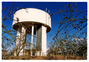
52 degrees 21'N - Water Tower, Bluntisham, Cambridgeshire,2000. C-type hand printed from negative.


52 degrees 31'N - Life buoy, Cambridgeshire, 2000. C-type hand printed from negative.

52 degrees 35'N - Wisbech, St Mary's Wash, Cambridgeshire, 2001. C-type hand printed from negative.

Again I like the idea behind these pictures. I think out of all of Heep's photographs I prefer the image above as the composition is simple and I find it quite relaxing to look at.

David Rhys Jones is well known for his limited edition filmstrip ceramic plaques from photographic ‘journeys’ he has made around Cambridge. For Hot Shots, David is also exhibiting larger pieces from his series A Bloomsbury Journey – London and Sussex. “In the London’s Bloomsbury, he visited houses where members of the Group lived and walked the streets they must have walked. In Sussex, he traced the footpath across the fields from Charleston Farmhouse to Berwick Church, which Vanessa Bell and Duncan Grant would have walked each day during the period they were decorating the interior of the church.” Below I have chosen several of his ceramic plaques showing Cambridge.

The Round Church, photographs and ceramics, edition of 20.


University Cycles, photographs and ceramics, edition of 20.


University Library Books, photographs and ceramics, edition of 20.

I enjoyed looking at all of David's images around Cambridge because with a lot of them I was able to say "I know where that is" which really helps the viewer to be able to relate to the pieces.


David Anthony Hall produces large, panoramic landscape photographs, which are mounted onto acrylic block, up to 3 metres long. These images can take weeks or even years to produce as David waits for the right light and environment to take his photographs in. In 2010 he took around 16,000 exposures and fewer than 15 were turned into prints.
Beech Thicket.

Unfortunately this was the only images of David's that I was able to post on my blog. The sheer size of his photographs was huge! You really felt that you were inside the photo. I had a discussion with someone else visiting the gallery about where in your own home you could actually put them!

Lin Osborn uses a series of small detailed photographs to create her original artworks. The subjects she chooses are generally everyday objects or are taken from the natural world.

Doors.

Lamps.


London.

Lin's images really contrast with David's panoramic images although they are just as striking but in a different way.  By repeating and repeating the series of images the original context of each individual image has been changed. Again I like how such a simple theme can have such an interesting effect as well as being visually attractive.

By visiting this exhibition I have really felt inspired to create something which does not necessarily have to have a complicated concept and can be on a scale. I now feel confident to go out an experiment with different ideas.


Information taken from www.byardart.co.uk

Exercise: Multiple points.

The aim here is to set up a still life with an unfussy, but not plain background selecting 6-10 roughly the same size objects. This exercise is about several points in the frame which implies a network of lines and can create an implied shape. For my still life I chose to photograph shells, which is hardly an original idea I know, but I feel it can work well and they are readily available as I seem to collect them each time I'm at the beach.
This is actually my second attempt at this exercise. I felt that my first try was not good enough, with the shells being slightly out of focus, and I hoped I could produce something better.

Image 1. I automatically placed the shells to the top right corner. I felt that they looked better overlapping rather than just laying next to each other as it appeared a bit dull.

Image 2. I placed the white shell to the bottom left to try and balance out the frame.

Image 3. The third shell was positioned here to draw your attention further down the frame.


Image 4. By adding the fourth shell, an implied triangle has been created to the bottom left of the frame.


Image 5. With the addition of the fifth shell the overall composition is more joined up and has a fluid motion running through it.


Image 6. I feel the final composition makes full use of the frame and I like how it looks as the the shells are spreading out from the rounded white shell.

We were finally asked to draw a sketch indicating any lines which relate the objects as well as any basic shape of shapes that have been formed.


I like how you can see the process of the image being built up and feel a sense of movement throughout the composition. This is my first proper experience of setting up a still life, I tend to always photograph what is already there, rather than produce something myself. Whilst I found it quite difficult to start off, I really got into it and the process of positioning each item.  The exercise has shown that with several points in the frame, the relationships between them are not as predictable. Looking  back at the shells at the bottom of the frame, I feel I have subconsciously created a regular shape but I am still happy with he overall look.

Thursday, 6 October 2011

Exercise: The relationship between points.

Our brief was to "find at least two normally occurring situations in which there are two points, and then compose and take the pictures without preconceptions, quite naturally".


By having just the one point in the frame it captures the full focus of your attention. However, when there are two points in the frame usually one point will dominate the composition and attract more attention than the other.


I this photo of two ducks on the river I feel that my attention is first drawn to the duck on the left first. I think this is because it appears much clearer against the water where as the one on the right is against quite a bit of reflection from the water. They both appear to be looking at the same thing so there is an implied line to that point.


With this image the duck to the right makes a stronger impression as it is nearest to the camera and therefore appears larger in the frame. There is an implied line running through them from the top left to bottom right as one follows the other.

There is an exception where both points attract full attention which is a close up of someone's eyes, where both points attract attention equally.


The image should be composed so that the eyes are equidistant from the centre of the frame. I have to say that rarely is someone's face perfectly symmetrical with eyes exactly the same size as eachother, I definitely do not have a symmetrical face!

You can notice by doing this that when viewing the image your attention moves between the points, never settling, as your eye is unable to resolve the composition.

“Two dominant points in a frame create a dimension of distance, a measurement of part of the frame”
(M. Freeman, The Photographer's Eye, p. 70, 2007).

Tuesday, 4 October 2011

The Face of the Artist - Photographs by John Hedgecoe.

I recently revisited the Sainsbury Centre for Visual Arts to view “The Face of the Artist Photographs” by John Hedgecoe.

This is the first major exhibition of portraits by renowned photographer John Hedgecoe from the Sainsbury Centre’s collection of more than 400 works by the artist, acquired earlier this year.
John Hedgecoe (1932–2010) was at the forefront of portrait photography for more than 50 years. He took pictures of the leading figures in the worlds of art, literature, science and politics, from Agatha Christie to Winston Churchill. His portrait of the Queen taken in 1966 is still shown on British postage stamps.
Artists and their art will be brought together in this exhibition, which not only features work by Hedgecoe but also works from the Centre’s permanent collections. They include Francis Bacon with his Sketch for a Portrait of Lisa, Henry Moore with his Mother and Child, Lucie Rie with a selection of her ceramics, and Lynn Chadwick and Elisabeth Frink alongside their sculptures.
Also on display there are photographs of other well known artists, including Edward Bawden, Sir Peter Blake, Sir Terry Frost, Dame Barbara Hepworth, David Hockney, Eduardo Paolozzi, Sir Stanley Spencer and Graham Sutherland. The Face of the Artist includes portraits of designers including Sir Terence Conran and Mary Quant, as well as a small number of photographs of literary figures linked to UEA. An internationally acclaimed photographer, teacher and writer, John Hedgecoe studied photography at Guildford School of Art. Following a period as an aerial photographer in the RAF, he joined Queen magazine as staff photographer. In the mid-1960s he established the photography department at the Royal College of Art, and in 1975 he became the first Professor of Photography. His photographs have appeared in leading newspapers and magazine titles and can be found in major collections around the world.
I have picked out four of the images where I feel Hedgecoe has really captured the character of his subject well.
David Hockney in his bayswater studio, 1972
The bright blond hair and round black framed glasses are are very much a trademark of Hockney's "look". The facial expressions adds an element of fun to the pose . Hedgecoe has chosen to show no background elements so Hockney is your only focus. If it were not for the title of the photograph we would not have any clue as to where is was taken.

Dame Barbara Hepworth in her familiar fur coat, 1970
In this photograph Hepworth appears rather fierce looking and a rather formidable character particularly as the angle of the camera has her looking downward as though looming over the viewer. Many images taken of her have her unsmiling and show her working on  her sculptures or in her studio. Hedgecoe has again chosen to photograph with no particular background present so Hepworth is your sole focus.

Mary Quant at home in Chelsea, 1964
As her biography says, "Quant brought fun and fantasy to fashion in the 1960s" and this has definitely been mirrored in her portrait. From the very patterned carpet to the clothes she wears and the gymnast on the wall, having been photographed in her own home the environment really does represent Quant's style.

Francis Bacon, 1959
Here I feel that Bacon's wild painting style, shown behind him, is reflected in in his facial expression and particularly the look in his eyes.

From visiting this exhibition I have realised just how important capturing the personality of the person is when photographing their portrait.

Information taken from www.scva.org.uk

Assignment 1 feedback.

Its been a while since I have posted anything as I have been ill but I am hopefully nearly back to 100% health.

I received my tutor feedback from the first assignment a few weeks ago and have been giving it a lot of thought. I initially took everything that was pointed out as criticism and I really started to doubt my ability to do this. If I start something I like to be really good at it straight off so felt slightly disheartened by my tutors comments. After speaking to him, and realising I needed to pull myself together, that I don't want to just pass I want to be the best that I can be.

From this I have then decided to take a look at my first set of contrasts, many and few. My tutor was not keen on the fact I had chosen to show the bikes in black and white and suggested I "look at the colour image and see what it tells you, can you isolate a few red bikes in blue bikes or a colourful seat cover in amongst many black seats? Look beyond the obvious pile of bikes and see what you can make of it." So I chose to go back to Cambridge station and re-photograph the image.


This is the first image I took as I wanted to single out the bicycle basket amongst all of the bikes. The image does appear slightly washed out which is another comment my tutor made. I think that this is a camera issue. I am still guilty of photographing with the camera on auto which is an irritating habit I must get out of. I think this is down to confidence with the camera settings but I will not get any better until I start practising more. If I can see where I am going wrong then I can improve.


Looking around further my attention was drawn to this bright green bike amongst some rather dull ones. I am happier with this image as I have hopefully stopped it appearing washed out. I am however disappointed that the moped is in the shot but from whatever angle I stood to take the picture, I could not keep it out of shot.

For my photograph to illustrate few I had heard about a bicycle in Cambridge that is on the wall of a building. I started to think that rather than show just the one bike to represent few, how about using this bike which actually only shows half a bike? After much research I managed to locate roughly the area I thought it would be in, and set out to find it.


I took several pictures and I do like this one but I rejected it as it is quite dull. The bike has been photographed quite centrally in the frame and it does not particularly contrast with its surroundings.


This picture wuld be by photo of choice. While the bike is still the main subject it is now placed slightly left of the centre which makes the overall image appear more interesting. I also like how your eye is then drawn down the lane to the building at the end which has be framed by the glass walkway. I particularly like how the bike also contrasts with the new, modern look of the glass and metal walkway. My tutor had mentioned about looking for secondary contrasts and I hope I have achieved that here.


I also need to give more detail of technical aspects which I really tend to lack in. I think this is because I am not comfortable with anything really technical but if I am to improve I must pay more attention to this side of things and increase my level of understanding. I really must start getting into the habit of making notes when photographing of the shutter speed, aperture, focal length etc that I have used. Is it possible to look back either on the camera or a computer at previous photos taken and review the settings they were taken in? I must try and find this out. I am hoping that by taking all of my tutors comments on board I will have noticably improved by the next assignment.


Sunday, 18 September 2011

Atlas Gallery of Photography at Snape Maltings.

I came across this gallery when I was working on my previous project (positioning a point) and had no idea it was there.

Atlas Gallery opened a new gallery space at Snape Maltings, Suffolk, to coincide with the 2011 Aldeburgh Festival, Snap Festival, which features work by a number of contemporary British artists and photographers.  The new gallery is the first extension of the main gallery in London where Atlas have built up their reputation specialising in photography in the UK.

The new gallery, the creation of its founder and director, Ben Burdett, provides an added visual arts space at the already present Snape Maltings concert hall site. The original Aldeburgh Festival was founded by Benjamin Britten and Peter Pears over sixty years ago as a Festival of Music and the Arts. The Atlas Gallery provides an extra, new dimension presenting photography alongside the already present galleries, auditoria and concert halls. Work that is to be  exhibited will include documentary, landscape, fashion, and contemporary works. The main gallery in London has provided expert advice to a wide variety of institutions and corporate collections, as well as to private collections, small and large over more recent years. The gallery aims to
“bring this expertise to a new audience at Snape, whilst also helping those to appreciating fine photography in the deeper understanding of its many complexities.”

The exhibition displays examples of vintage and contemporary work, with solo exhibitions by some of the most renowned names in the history of photography.

The gallery is housed in an old out building on the maltings site. The photographs are just around the white walls of the fairly large room with quite a lot of unused space in the centre. Below I have included some of the images seen.


Elliot Erwitt, Cannes, France, 1975

Elliot Erwitt, Cannes, France, 1975 


I like the contrast between these two images. The first seems like a nice calm sunny day with two people just enjoying the weather. Without their presence in the second image there is much more movement with the wind blowing through the empty seats. I find this second photograph much more interesting because of this as the first image is a bit too static.


Ernst Haas, Albert Einstein, Princeton, New Jersey, 1953


Everyone who looks at this photograph will instantly know who is pictured. Einstein is stood in what appears to be his office, surrounded by many books and papers in what can only be described as chaos.  Even though this picture looks like it has been spontaneously taken I am sure that much thought has gone into the exact location of the shot and Einstein’s positioning. With him centred in the frame he is very much the subject without the overall image appearing dull.

 
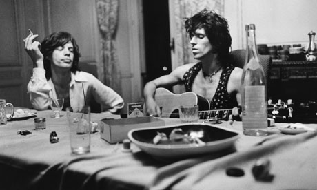
Dominique Tarle, Mick and Keith, Villa Nellcote, 1971.

This photograph obviously shows Mick Jagger and Keith Richards. With this picture it seems as though you are catching a glimpse of their lives, as if you are there with them. There are another two glasses at the table, who else is relaxing with them?

Nick Brandt, Portrait of two zebras turning heads, Ngorongoro Crater, 2005


At first glance it seems as though the image of the zebra has just been replicated. Taking a closer look there are slight differences  with the stripes on their bodies and faces and the zebra on the right is resting its left hind leg. This is also a much more modern looking shot compared to the others and I could image it hanging on the wall in peoples houses.

I feel it is easy for people to connect with this exhibition as you are bound to either recognise the name of the photographer, the place being photographed of the famous faces in many of the pieces regardless of how interested in photography you are.

Sunday, 11 September 2011

TAOP Positioning a point.

I am now moving on to the second part of TAOP. This first exercise is about how positioning a point within the frame can alter the movement, balance and division of the image as a whole. To be classed as a point, the subject must be small within the frame and in some way contrast with its surroundings.

Objects that could be classed as a point:

·         Flower in a field
·         Hot air balloon in the sky
·         Tree
·         Sculpture
·         Plane or birds in the sky
·         Boat in the sea
·         Animal in field
·         Duck on water

I have started by reviewing my previously taken photographs to see if there are any points that clearly stand out and found that my images tend to show the focal point in the centre of the frame. I have then gone on to take photos specifically for this exercise.
For this exercise I used a sculpture by Barbara Hepworth which can be found at Snape Maltings. I have converted the images I took into black and white which had been suggested in the course notes. This allows me to focus on the point rather than looking at the contrast between the colours shown in the photos.


Central position


This is my least favourite image. I feel that the positioning does not work with the sculpture in a central position as is looks very static and uninteresting. The point looks rather flat and does not particularly stand out very well.

Positioned close to the edge of the frame


Having walked around the sculpture to change the composition I have realised that placing the point where I have, near the edge, encourages the eye to wander around the frame searching for other subjects. I do like the the detail of the grass in the foreground but it does detract from the point somewhat.

Off centre to the right


The position of the point works better in this photo. Having the sculpture slightly off the centre point creates more depth and is definitely my composition of choice.

Conclusion.

From this exercise I have learnt that positioning the point can dramatically alter the sense of movement in the image, as having just the one focal point naturally divides the frame. By positioning the point in the centre of the frame, the overall movement is affected creating a static nature (although in some instances this can work if justified). In some photos having the point close to the edge of the frame does not work as it can detract from the point and unbalance the frame, whereas in other images it can help to convey more of a scene. I have realised from working on this exercise that I am guilty of positioning a single point in the centre of the frame, usually so that it fills the frame, and therefore creating rather a dull image.