Monday, 19 November 2012

Exercise: Highlight Clipping


For this exercise I am to find a scene with a wide range of brightness. This was a challenge in itself as the weather has been so dull that I had postponed completing this assignment and had moved on to others. Luckily this weekend there has been a bright sunlight (accompanied by a harsh frost). I decided to pick the view over the stud that my house looks over, that way I do not have to be out in the -3 degrees for very long.

I did struggle with this exercise to start as I was not aware if my camera had a highlight clipping warning so it meant thoroughly going through my manual before even beginning. After a short while I managed to find the setting , and with some trial and error, managed to switch it on. I decided to find the setting where the highlight clipping warning just appears and then alter the exposure by adjusting the shutter speed.

First image where the highlight clipping warning showed.
1/400 f5.6 ISO 200 98mm WB Auto.


The next image shows the exposure increased by one f-stop which shows a much wider area of clipping.
1/320 f5.6 ISO 200 98mm WB Auto -1


I have then taken 3 further shots, each one decreasing by one f-stop.

1/500 f5.6 ISO 200 98mm WB Auto +1


1/640 f5.6 ISO 200 98mm WB Auto +2


1/800 f5.6 ISO 200 98mm WB Auto +3


When I first examined the areas of highlight on Photoshop I noticed how the clipped areas were much larger than they had appeared on my camera. Zooming in on the clipped areas of the first and second image I took the detail is pretty non existant with the colour of the sky being bleached out and you can see a definite line where white meets nearly white. The last three images the area of clipping is much smaller but the detail has again disappeared. The exposure decrease by 3 f-stops actually has no areas of highlight clipping present but I think that I should be aware of the shadown to the bottom right. The colours are much more saturated on this image too and overall I prefer it as it contains the most detail.
I have to say that this exercise has troubled me the most. It has very much been a learning process as I had to research highlight clipping a lot first to make sure that I thoroughly understood it, then I had to re read my manual to find the right settings and then on photoshop (which I only use for very basci editing) I then spent far too long working out where the button was to even show the clipped areas. I persevered with this much longer than I normally would as I tend to get disheartened quite quickly, and I am glad I did as I really feel this exercise has taught me a lot.


Monday, 12 November 2012

Exercise: Sensor Linear Capture

" Take any TIFF or JPEG image and open it in Photoshop Elements. Convert it to 16 bits per channel. Go to Image> Adjustments> Curves and make a curve".
 
My first problem was that when I opened Photoshop Elements that it would not allow me to convert to 16 bits per channel, it would only offer 8 bits per channel. In the end I downloaded a free trial of CS6 which luckily worked.
 
The image I chose was one I had used for a previous project producing a portrait. shown below is the original image.


I selected my image and then followed the instructions. The image then appeared as shown below.


As you can see the linear image here the tones are mainly squashed to the left pf the histogram.
 
I have then tried to create a curve using the linear image to try and make the image as close as possible to the original version. My best attempt at this is shown below.


Carrying out this exercise has shown me how a digital camera sensor captures an image in a basic 'linear' way and then converts it into the image that we see.


Sunday, 11 November 2012

Assignment One - Workflow

Before beginning this assignment I carefully considered my topic to shoot and how it would fit in with the assignment criteria. I felt that my main options were to do street photography, use the images I had shot of Melford Hall or use my place of work. I decided that I wanted to explore street photography a bit more without the stress of shooting for an assignment hanging over my head. I tend to go into assignment mode and stop shooting as naturally. I also did not have the time to fit in travelling very far so I would need a subject closer to home that was more easily accessible. I then moved on to my Melford Hall option, but felt that this fit the previous exercise about editing much better. This then left me with the idea of using my place of work, which obviously had the added bonus that I am there most of the time so could easily fit in shooting, plus I feel comfortable in the surroundings.
I currently work for a veterinary referral centre which is in the grounds of Lanwades Park. In the centre of the grounds is a lovely house which has been used for weddings. The hall was completed in 1907 and was built by Mr. J.W. Larnach. He paid for it using the £5,450 winnings which had come from a £500 bet he had placed when his horse Jeddah won the 1898 Derby. It is built in the style of 16th Century properties with prominent red brick chimneys. King Edward VII actually stayed at Lanwades Hall when he attended the Newmarket Races.
Planning the shoot.
I had decided that I was going to go back to work at a weekend when the site would be much quieter so I would hopefully not get disturbed. I was hoping for a relatively nice day rather than wet weather which was more than likely at this time of year. I know the site well having worked there for just over seven years so had potential shots in mind as well as intending to walk around quite freely.
I thought about the equipment I would need to take with me. I currently only have the one lens at the moment, a 18-105mm, so that was a rather easy decision but I feel that this will be more than sufficient for what I will be shooting and is a good all round lens. I decided not to take my tripod with me, whilst it is light it only collapses up to a point and as the site is very large I did not want to carry it around for miles. I also did not feel that I would need it for the images I intended to take.
Before setting out I reset my camera settings, wiped my memory card so that I would not run out of space, made sure my camera lens was clean, checked the memory space on my laptop so that I would have room to transfer the images over and charged the cameras battery.
The Shoot.
The shoot did go as planned to a certain extent. I ended up making two trips over two consecutive weekends. The first weekend that I went the weather was quite bright but it was absolutely freezing cold. I really needed gloves on but I then could not alter the camera settings and had to keep taking them off. I had not picked the best time of day to go; the sun was high which meant that whichever angle I took it was in the wrong place making images appear over exposed when I was really looking for a richer colour. Altering the cameras exposure did little to help. I felt like the day had become a bit of a disaster so I returned home with around 20 images. I then set out the following weekend having really thought about what I was trying to achieve. I decided to head out earlier in the day as I felt the light would suit the topic much better. I also had the weather to contend with, we had had torrential rain all night and when I got up that morning the idea of working on the assignment did not seem promising. Luckily there was a break in the rain and as my kit was all ready, I headed out.  Shooting went much better than the previous week and I ended up with a total of 68 images before the weather became unbearable again. I was very happy with some of the images I produced, with everything still wet from the rain the colours were much glossier and had a better quality.
Downloading the images.
I downloaded all of the images onto my laptop in the pictures folder and then viewed them using Adobe Photoshop CS5. I know many people prefer to label using just the date but that means nothing to me. I personally prefer labelling the reason for shooting/occasion and include the date if necessary. So to find these images I search:
Pictures> Digital Photographic Process> DPP Assignment1.
I tried various ideas for labelling on the Art of Photography course I studied previously but I find this much easier when looking for certain images on my laptop.
Editing.
Technical Edit.
I started out with 68 images and viewed them all. I edited out any shots that were technically unusable such as those that were blurring and out of focus or the exposure may be incorrect. I then delete these images as they cannot be used for anything. I was quite surprised when I only deleted four images.
The Selects.
I was now left with 64 images. This time I went through all of the images again and edited out shots that I had several of. These images showed exactly the same scene but with a slight technical difference such as the exposure being altered for each one. I also removed images from my choices that I felt the composition really did not work.
First Selects.
From the previous edit I was left with 42 photos. I went through these images again bearing in mind that I could only select up to 12 images to submit. I was quite harsh and edited down to 20 photos which I then put into a separate folder so that when it came to review them I was only evaluating the images I felt strongly about rather than all of the shots I had taken.

Group and Review.
I leave the images a couple of days before reviewing my choices. I wanted to be more critical of them and feel that doing this helps. In the past I have been out on a shoot, come home and carried out the editing process all on the same day and then regretted my decisions. I wanted to almost be viewing the photos as an outsider with no link to the images. When I did review the shots I was happy with the choices I had made.
A Final Choice.
I went through my final 20 and decided that I needed to be harsh with myself and only submit the images that I really liked. I had put my first selects in a separate folder so they were easier to review again and edit down. In the end I found that I had seven images that I particularly liked. To begin with I felt conscious that the brief states 6-12 and that I should be including more photos but I do not think that you should start adding photos for the sake of it just to meet a quota. I very happy with the seven I have picked and feel that they give a broad but accurate view of the site I was shooting.
Post Processing.
Using Adobe Photoshop CS5 I then checking the exposure and making any minor adjustments such as cropping to improve composition. I was to submit the images as prints so as my printer will still not connect to my laptop I needed to burn the photos onto disc and have them printed off. This was actually a new experience for me as I am rather ashamed to say that I have never printed off any of my images! For the art of photography all of my work was submitted digitally. Looking back I should really have printed some of the photos out, even just for myself. I ended up using a self service kiosk to print my photos out for this assignment. I have to say that was a bit of an experience for myself and I am not sure that boots is really the ideal place to develop really good quality prints. I did not realise in some respects just how different the photos look printed out. On screen they all look very clear but looking at the prints in front of me you can pick out several flaws that I had not previously noticed. This assignment is really turning out to be a learning experience for me which I am really glad about.
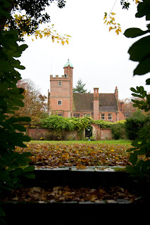
1.      The Hall. 1/80 f5.6 ISO 400 35mm -0.7 WB Cloudy. I wanted to shoot an image of the Hall which showed its most distinctive features such as chimneys. The idea behind this shot was to try and create a picture frame effect around the scene using the bushes. I think that the shot came out quite well but it is let down by the gloomy uninteresting sky.
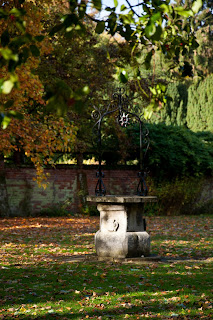
2.      The Wishing Well. 1/500 f5.6 ISO 500 105mm WB AUTO. This photo looked clear on the laptop but has a blurry finish on the print. I was very disappointed when I first saw this but after thinking about it, it reminded me of how things appear in a dream; there is something a bit secret garden about it. I actually think it is quite fitting as it is of the wishing well. I am sure other people will look at this shot and “out of focus, terrible shot” and part of me does agree. But, I love how the light has shone through the trees creating a dappled effect and using light is something I am trying to improve on which is why I have still included the shot.
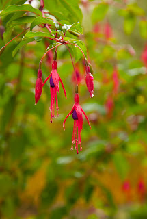
3.      Fuchsia.  1/80 f8 ISO 400 75mm WB Cloudy. I did not just want to send endless images of the Hall but wanted to show the site as a whole. There are some lovely gardens and plants which are why I think the site is popular not just with dog walkers, but now also as it has become a wedding venue. This was taken on my second visit to shoot and the bright pink really caught my eye. On closer inspection you could see the raindrops on the ends of the flower. I really like this photo and think that the print also came out well. I love the glossy glass like appearance of the raindrops and how you can even see the pollen. If I had to pick fault I would say that maybe I should of adjusted the aperture slightly so that the background was not quite as blurred as I have made it.
4.      Tree lined pathway. 1/80 f5.6 ISO 400 75mm WB Cloudy. I chose this shot because from this vantage point you cannot see where the path leads. I like how the steps lead your eye up the frame and then the row of tree encourage your gaze along the pathway.
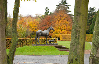
5.      Statue. 1/80 f5.6 ISO 400 40mm -0.7 WB Cloudy. Post production I have cropped this image slightly. Again with this image I wanted the trees to frame the bronze statue of the horse, dog and cat......the main animals that are treated here and that appear on the logo. There are many photographs of this statue and I wanted to try and produce an image of it that I had not seen before.
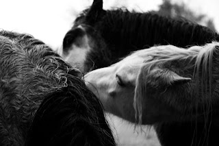
6.      Ponies. 1/80 f5.6 ISO 400 70mm -0.7 WB Cloudy. There are many ponies that live on the acres of land on the site. I took many photos of them but I was looking for something a bit more interesting than a pony’s portrait. Unfortunately I turned up when they were all having breakfast so nothing was more important to them than eating. When they did notice I was there they all wandered up to the fence and stood in a row with their heads through the fence. Whilst this did look quite comical it was not the natural image I was hoping for. Eventually they started to lose interest in me and began behaving naturally which is when I managed to take this photo. I was hoping that the print would come out better than it has because on my screen it looks nice and clear, I need to work out why this happens. Maybe the original image is not as clear as I think. I probably should have used a faster shutter speed considering my subject was unlikely to stay still for very long. The colours of the ponies got me thinking about contrast so whilst in Photoshop I decided to really up the contrast and convert the image to black and white. I think this suits it really well. I do not like converting to black and white for no reason, and even though I love black and white photography, I rarely do it. Here I feel that there is a reason behind doing so, rather than just trying to appear artistic, which I think is often the case.
7. Trees. 1/80 f5.3 ISO 40075mm WB Cloudy. The whole site is full of beautiful trees and now that the weather has turned, and the leaves have changed from green and are starting to drop, I was struck by how much more interesting they look. My eye was immediately drawn to the gold of the leaves and how they contrasted with the green of the plant at the base of the tree trunk, as well as the green of the bushes in the background. I really love this shot even though it shows autumn in a stereotypical way.

Conclusion.
I have found this assignment particularly beneficial, being able to consider my workflow and analyse how I can tailor it to suit my needs. My workflow may differ from that of a professional photographer in the sense that I do not take as many images as a professional would. I think that a professional would also have a different editing process and I think that my method probably needs some work so that I am more efficient. As time has gone on I have started to take many more images than I would, tending in the past to only shoot images I knew I needed and generally doing away with editing. I have found this section of the course so interesting in particular developing my personal workflow.
In addition to working on this assignment I have also begun reading one of the set texts Mastering Digital Photography, Michael Freeman. I have really got in to it as I am trying to focus on lighting and my use of it at the moment. It has given me many ideas that I cannot wait to try out.
Reflection
Reading the assignment criteria I have tried to review how well I think that I have done.
Demonstration of Technical and Visual Skills – I feel that I have a fair grasp of techniques but I am obviously learning all of the time. I think that my observational skills are good and I always try to produce interesting compositions.
Quality of Outcome – I do try to apply the knowledge I have gained while studying with the OCA. I think that my work is presented neatly and coherently.
Demonstration of Creativity – I do try to be creative but I feel that there is room for improvement here and I need to try and use my imagination more.
Context – I think that I am good at reflecting on my work and can see areas I need to improve on. I carry out my own research, visit galleries, work on my own projects and undertake further reading.


Wednesday, 7 November 2012

Exercise: Editing.

"For this exercise you need to start with a set of recently shot images. Try to work with a reasonably large set of images, at least 50, all covering the same theme or location."
 
I chose to use images I had recently taken for the National Trust. I had just started volunteering as a photographer for their Melford Hall property and they had asked that I try to provide them with images of the hall all in portrait to fit on their leaflets. I managed to shoot 95 photos which I then needed to edit down to provide them with a handful of images.
 
Step one - the technical edit.
 
I removed any images that had obvious faults to them. Four were over exposed, mainly as the day was very bright......not ideal for what I was trying to do, two were out of focus which left me with 89. I currently have Photoshop elements 9. I view each image as a thumbnail, removing any images with faults from my main screen. For the technical edit I deleted any image that was not up to scratch, particularly as I shoot in RAW so I do not want vital memory space taken up. Also having just had to buy a new laptop I am trying to keep it much more organised than my old one.
 
 
Step two - the selects.
 
Here I have gone through all of the images and have tried to be quite ruthless. I wanted to halve the number of suitable images and managed to select 42 in the end that I felt more strongly about. I did this by removing any image that may appear similar to others I had taken. I had several of the same angle of the hall, the only difference was the exposure as I was unsure at the time how the image would turn out due to the exceptionally bright day.
 
 
Step three - the first selects.


I then edited down to seven images which was easier than I thought it would be as I think that you immediately get a feel for whether an image is right or not.
Notes to explain why I preferred these images (from left).
1. Shows the majority of the hall including its distinctive roof, without showing the scaffolding they currently have up.
2. Nice symmetrical image of the hall through the hedge so your eye is drawn up the frame to the doorway.
3. View through the trees, focusing on the roof meeting the skyline.
4. View through the trees showing part of the hall and gardens.
5. Shows a building in the grounds and the gardens.
6. The hall from a distance, through the flowers.
7.  View of the hall also reflected in the pond.
 
 
Step four - group and review.
 
As instructed I took a break of several days and then when back to review the images. I put the first selects  together which was easy as I had saved them all in one folder and then reviewed my choices. I then reviewed the images I had left out to make sure that I had made the right decisions and I still felt the same about the shots I had rejected.
 
 
Step five - a final choice.
 
Here I was to imagine that I could only select two images for publication.


I chose these two images, not only because I particularly like them and they were my favourites at the time of shooting, but also because they fill the criteria that I was originally shooting for. This was to produce images that show the hall with its distinctive roof, in portrait as opposed to the usual landscape images. Ideally I would of shot the images on a slightly more overcast day, as there was very little cloud in the sky the bricks have lost some of their deep red colour.


Sunday, 4 November 2012

Exercise: Histogram

The aim of this exercise is to increase familiarity with histograms by relating each one to the images we have just shot. Histograms appear twice in workflow, once on the cameras LCD screen and again when the image is being processed. When shooting in RAW the histogram is not taken from the RAW file but instead from a JPEG so a slight difference may be present from the camera histogram to the histogram then shown on the computer.
We are to choose three subjects, one with low contrast, one with average contrast and one with high contrast. for each picture situation we are to take an average exposed version, one that is one f-stop darker and one that is one f-stop brighter. We should finish with nine images.
 
Low contrast.
 
 
1/50 f5.6 ISO 200 90mm -1.0


1/25 f5.6 ISO 250 92mm Average exposure


1/13 f5.6 ISO 250 92mm +1.0


The histograms appear much as I expected but I did think that they would be flatter than they are, maybe the shot was not as low contrast as I thought it was. The values are quite squeezed together however. Altering the exposure has affected the histogram exactly as I expected it to with under exposure appearing on the left and over exposure values on the right.
 
 
Average contrast.
 
 
1/125 f5 ISO 250 38mm -1.0


1/60 f5 ISO 250 38mm Average exposure


1/30 f5 ISO 250 38mm +1.0


The average contrast  images appear similar to how I expected although I thought that the average exposure shot would be a little flatter.
 
High contrast.


1/50 f5.6 ISO 250 105mm -1.0


1/25 f5.6 ISO 250 105mm Average exposure.


1/13 f5.6 ISO 250 105mm +1.0
 
 
The histogram here is not quite how I expected it to look. I thought that the shifts from left to right would be more obvious than they are although the values are spread right across the histogram.
 
I found this exercise more difficult than I expected but it has been useful as I have never paid as much attention to the histogram as I should. Tending to instead rely on the image shown on the LCD screen and then how my shot appears on the computer. I now intend to analyse my shots more thoroughly.


Saturday, 3 November 2012

Tim Walker - StoryTeller


When I heard that this book was coming out I just had to order it. I love Tim Walker and his unique approach. When you see one of his images you immediately recognise the style. I was not disappointed at all.
The book “reveals just how much one man’s singular vision has influenced contemporary tastes in fashion, beauty, glamour and portraiture”.
 

Stella Tennant and pink powder cloud. Fashion: Peter Jensen. Eglingham Hall, Northumberland, 2007
 
The foreword has been written by Kate Bush which I feel fits really well with the book. She quite rightly states that “Tim’s extraordinary work takes us on a journey in to his exotic imagination, where giants, dreams and broken fairy tales are all welcome”. When I look at his work I draw similar comparisons to paintings by the surrealist Salvador Dali. Walker’s photographs very much appear like a child’s imagination such as Humpty Dumpty being broken in half, or the plane made out of baguettes and yet there is a luxurious quality to them. This is particularly seen in the drape of cloth or in the flowers and decorations. Many of the images were shot in Glemham Hall or Eglingham Hall, both of which are large stately homes emphasising luxury.


Giant doll kicks Lindsey Wixson. Fashion: Louis Vuitton. Eglingham Hall, Northumberland, 2011
One think I did notice and had not previously realised was that Walker avoids using digital photography in favour of film. Does digital photography make things too easy and allow anyone to become a 'photographer'. I have not used a film camera since I was a child and you were given a plastic point and press. I rely on my SLR because you see immediate results and can tell where you have gone wrong. I would love to give proper film photography a go and think this is something I should learn more about.


Karlie Kloss in gold feathers. Fashion: Alexander McQueen. Shoreditch, London, 2010
“Photography is a magic thing! A magic thing with all sorts of mysterious smells, a bit strange and frightening but something you learn to love very quickly”. Jacques Henri Lartigue.
The book also shows sketches drawn by Walker as he explores various ideas and concepts for shoots. I found it, in some ways, more interesting to view these. I was intrigued how he arrives at the final image and the process he goes through to come up with an image.


Vivienne Westwood in coral tiara with roses. Fashion: Vivienne Westwood. Shoreditch, London, 2009
I felt so inspired looking through this book. I love so many genres of photography and fashion is one of them. Walker has shot for many of the fashion houses such as Mulberry, Louis Vuitton, Valentino; as well as famous fashion magazines including British, American and Italian Vogue, Harpers Bazaar and Vanity Fair. Reading this book made me question what I hope to achieve in my photography and the style I am working to develop. Maybe in some way I feel intimidated and wonder whether I could ever produce anything half as good as I believe these images to be. I must remember that everyone has their own strengths and style of shooting, I just need to develop my confidence and not be afraid to explore new ideas and techniques. I am so glad that I bought this book, not only because Tim Walker is someone I admire, but because it leads the reader to contemplate their own direction.

(Tim Walker, Story Teller, Thames & Hudson 2012)


Thursday, 1 November 2012

Exercise: Your own workflow 2

We are to again devise a workflow for a specific shooting assignment but this time the assignment should unstructured and open ended. The number of images will be unpredictable and the shoot should last a length of time that the photos may need reviewing and editing as we go along rather then waiting until the end of the shoot.

Planning.

Visit Cambridge city centre photographing people as they go about daily life, architecture, market square, bikes. If I was commissioned for this shoot then obviously I would be meeting my clients criteria.

Preparation.

Charge batteries, check memory card, check file space on laptop, reset camera settings from previous shoot.

Shoot.

I set off early morning so that I would catch people on their way to work or college. Luckily Cambridge is always busy regardless of what time you go so I was likely to see crowds of people either way. I had chosen Cambridge because it is my nearest city, about 14 miles from home, and there is always a lot to see. My approach consisted of taking a walk around the city centre constantly think of different compositions and trying out different shots. Some of which may then be edited if I felt they were not what I was looking for. Any that I was not sure about could wait until I put them on the laptop and could assess them properly. In the end I only had a spare hour which I thought would be plenty of time but it turned out to not really be that long. I would of liked to of had time to go down to the river and photograph people punting. Because I had my camera out the whole time I was subjected to many people approaching me as they thought that I was a tourist! Many of which where trying to get my to pay to go punting. By the time I had finished, after editing as I was going along I had taken about 35 shots. I estimate that I had probably shot 15-20 more.

Post shoot.
 
Once home I loaded all the images onto the laptop and started to remove any images with signs of blur of that were not technically suitable. After this I looked at the images the day after and selected the ones I felt were accurate to what was happening at the time of shooting. Some that I felt strongly about at the time didn't come across as well as I had hoped. I edited the images down three times so that I was left with two images that mean something to me.


Final Images.


1/60 f13 ISO 200 45mm WB AUTO

I chose this image as one of my final selects because I feel that it represents Cambridge quite well. There are quite a lot of people that sell the big issue or busk. This shot shows the woman with the long hair having completely ignored the seller's presence as she walks straight past. I see this happen all the time, even if I do not buy from them it is always nice to acknowledge them, even when you are in a rush.


1/60 f13 ISO 200 62mm WB AUTO

I chose this image because it contained many factors that represent Cambridge. It has a church in the background, shows the market square and people cycling. You can never get away from bikes in Cambridge. I particularly like the feeling of depth in this image with the many layers. I also like how your eye is drawn to the tree in the centre and then the four red phone boxes. I like how the line follows down from the church tower, emphasising height.


1/50 13 ISO 200 105mm WB AUTO

I decided to leave this picture until last as it is my favourite, mainly as I have a personal link to it. When I was little and used to visit Cambridge there was always an elderly man who used to walk around the city centre wearing an old suit, top hat and pushing a cart. In the cart there used to be a variety of animals. He would also usually have mice running around the brim of his hat. All the children loved him. Sadly he died some years ago now and this sculpture was created in his memory. I particularly like the fact that I have managed to capture it with a child having been drawn to its bright colours and smooth touch.


Conclusion.

From carrying out this project it has made me think further about the process I go through before shooting a series of images. I also think that it has reinforced the fact that your images should relate to you in some way. Having a personal connection makes for a stronger image in my opinion.