In preparation for
this assignment I looked back at my previous work since beginning the course to
see how far I have come. I am still guilty of lacking in confidence and doing
this has helped me, as I can see that I have improved since the start. I seemed
to make a bit of a break through with the previous assignment as I finally
started to photograph subjects that were more ‘me’. I am hoping that this will
continue into assignment 4 and I can carry on the creativity. I feel I have
found this set of projects the most challenging so far. I have had to improvise
with setting up my lighting as I do not own much equipment, but I hope that
this hasn’t held me back and I have had to be a bit more creative. Because I feel
I still have a lot to learn in this area I have decided to treat this
assignment as more of a learning process by using it to experiment and see what
I can achieve, rather than panicking like I normally do that I can’t do it. I
always think of the assignments as having to be a finished piece, rather than
using them to ask questions on techniques for example. I also think that now is
a good time to see how my new, and hopefully improved, naming system is
working.
I began to think
about the object I would photograph and toyed with many ideas. My first obvious
choices were fruit or vegetables or some kind of ornament but I was rather
reluctant to just pick any object randomly. I read through the qualities the
subject should display via lighting to see if this would inspire me. I finally
decided on a fabulous pair of shoes I bought myself for my birthday. They
remind me of the brilliant night out I had with friends, so I want to show them
at their best. Being a typical girl I am immediately drawn to shoes, so I can’t
believe I didn’t think of this sooner.
Now that I have my
subject I started to research how shoes have been photographed, mainly for
advertisement purposes, out of curiosity to see how the professionals approach
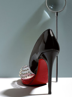
the subject. I came across this image of a Christian Louboutin shoe taken from http://yatzer.com/Christian-Louboutin-Unveiled
and chose to include it in my assignment notes because I feel it displays some
of the qualities I need to show with my subject. The first thing that strikes
you is the colour. The shoe has been positioned to make the red sole the first
thing that is noticed, this is particularly important as this is the trademark
of Louboutins and makes them the most recognised shoes in the world. The shape of the shoe has been replicated
with the photographer having lit the set to create the perfect shadow. Texture
is also shown really well with the shoe appearing particularly glossy with a
high shine. The positioning has created depth within the scene to create more
of a 3 dimensional image. I am hoping that I can shoot to draw together these
different techniques to show the qualities of my subject.
I also came across
this website from the OCA facebook page, www.theicebook.com
, and felt that it was worth mentioning with this assignment. This is mainly
because I would never have thought to have used lightning in this way. The
creators combine a popup book of exquisite cut outs with lighting and back
projecting characters on to the pop ups so that they appear to be moving around
them, therefore creating the illusion of perspective. What they produced can
only be described as beautiful, I felt completely mesmerised by it. The time
and patience that has gone in to this work is unbelievable and I am amazed at
what they have produced. I feel inspired to really do my best and photograph
images that I feel really happy with.
Shape.
Photo – TAOPart4Assignment4Shape1
1/50 f13 ISO 3200
18mm WB Auto
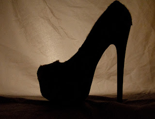
To emphasise the
shape of the shoe I photographed it with the light source behind it in the hope
that it will contrast well with the background and I was aiming for a
silhouette look. I also wanted there to be a minimum amount of detail shown so
that the focus is the outline of the shoe. I have realised that setting up each
shot is much more time consuming than I had previously anticipated,
particularly with regards to where the light source should be positioned.
Unfortunately the lamp has picked up all the detail in the sheet I was using as
a background. It took a while to get the positioning right as if the light was
too close to the scene then it became too harsh so I moved it away slightly.
Fitting my greaseproof paper diffuser also helped, as did positioning the bulb
so that it was hidden by the sole of the shoe. If I was shooting this again I
would ideally use a soft box to diffuse the light more evenly and this would
probably create more of the look I was hoping to achieve. Post production I have
altered the exposure slightly as well as the vibrancy.
Photo – TAOPPart4Assignment4Shape3
1/15 f3.8 ISO 400
24mm WB Auto.
To again show the
shape I wanted to try and use rim lighting. This is an effect that is created
when back lighting creates a rim of light around the subject in a ‘halo’ effect
and therefore separates the subject from its surroundings. To try to achieve
this I had two small lamps one behind but to either side of the shoe as having
it directly behind made it visible through the heel. I love the effect created,
it was exactly what I wanted, if I had to criticise it I would have to say that
ideally I would have liked the light to go round more of the shoe to really
make it stand out. When I had tried showing more of the heel, due to how shiny
it is there was so much reflection that it became more of a distraction.
Form.
Form is another way
of describing the shoe and demonstrating how 3 dimensional it looks. I have
tried to show as much depth as possible in my images.
Photo – TAOPPart4Assignment4Form1.
1/3 f4 ISO 640 24mm
-1.0 WB Auto
I have struggled the
most shooting form out of all of the qualities I have needed to show. I think
that I have found it difficult as I feel that I am trying to show a 3D object
as 3D. This took me a while to get my head around as I just kept thinking “but
it is already 3D”. Actually stopping and thinking about it I realised that I
have viewed, and also shot, many images myself which whilst they have been of a
3D object they have come across as 2D and very flat looking. I had never really
given this whole idea much thought before and now feel that it is very
important to how we view and shoot ourselves. You need to be able to show an
object in a way that truly represents it and that is what I have tried to do
here. I do think that with this attempt I may not have got it quite right and
have struggled to produce the image I have in my mind. I think that maybe the
shadow is not quite right but to be honest I am a little unsure. I placed my
lamp to the front left of the set up, with my diffuser in place. I also used
tin foil as a reflector which was placed to the right of the set up as I wanted
to reflect some of the light back onto the shoe. I wanted to use the shadow to
help give a feeling of depth but I also felt I should be aware of the shadow
and thought that it looked better and more 3D using the reflector to fill it in
slightly. I wanted to include this less than perfect image in the assignment
as, like I said at the beginning, I want to treat this one as a learning
experience and hope that a greater understanding on where I am going wrong will
make me a better photographer.
Photo – TAOPPart4Assignment4Form2.
1/40 f5 ISO 2000 42mm
-1.0 WB Auto
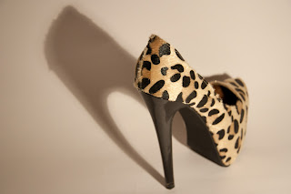
This may possibly be
my favourite image in the whole assignment (a close call with texture2) and I
actually want to produce a large print of it for my wall. I feel that there are
some similarities with the shot of the Louboutin and maybe that has inspired
me. I have gone for a white background which is something I tend not to go for,
much preferring black as I generally think it looks more attractive. I think
that I have actually been proven wrong here and will be shooting with a white
background again. The only light came from my tungsten lamp which was
positioned to the right side of the shoe. This shot was actually to a certain
extent quite accidental. I had set up the shoe and back ground of a piece of
white card loosely curved, just to practice with what I could produce. For some
reason everything seemed to come together well and I like how the shadow is
almost like a second shoe, which to me emphasises the 3D nature of the ‘real’
shoe. Also having the toe of the shoe more out of focus that the heel gives
greater perspective, again highlighting form.
Texture.
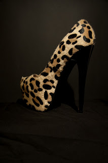
One of the reasons I
chose this shoe is because of the texture of it. It has been made to look like pony
skin and I wanted to pick up the detail in the hair.
Photo – TAOPPart4Assignment4Texture1.
1/40 f5 1250 52mm
-1.0 WB Auto
I wanted to highlight
the faux pony skin that covers the shoe in this image. I had originally wanted
to fill the frame with the leopard print pattern but as soon as I zoomed in the
whole image became blurry and out of focus regardless of what I tried. I think
that this is down to my lens, which is the only one I own. To overcome this I
have had to be a bit more creative with my set up. I decided to wet the hair on
the shoe slightly to make it stand out from the shoe more. I also lit it from
the front left hand side so that I could try and pick out the detail a bit
more. I actually really like how this image has come out and feel that the shot
is much more interesting than my previous idea would have been.
Photo – TAOPPart4Assignment4Texture2.
1/40 f5 ISO 1250 52mm
-1.0 WB Auto
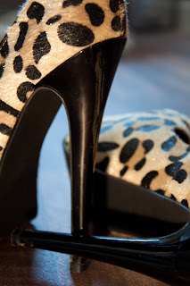
For this image I
wanted it to look like the shoes had been casually abandoned after a night out,
as mine normally are. I have blurred the background so that it is not in focus
and that the viewer’s sole focus is just on the shoe. With this shot I wanted
to emphasise the shiny quality of the heel. Using my tungsten lamp again with
my greaseproof paper fitted to it, as well as natural lighting, I have tried to
highlight this area. I realise that there is reflection of the shoe lying on
the floor in the shoe standing up but I wanted this as I feel that it
highlights the texture more strongly. For this particular quality I revisited
Light, Science and Magic: An Introduction to Photographic Lighting as it has
sections on reflection and glossy black surfaces for any helpful tips, but I
also wanted to experiment with my own ideas. The book gave the impression that
generally reflection can be a hindrance and unsightly in images but I think
that it can add to a photo. This was also mentioned in Creative Lighting:
Digital Photography tips & techniques where is says that “it should be a
matter of aesthetic choice- if it adds to the photo, do it.” I agree with the
statement and stand by my decision to show the reflection in the heel.
Colour.
Here I have tried to
show the colour of the shoes as strongly as possible.
TAOPPart4Assignment4Colour1.
1/25 f4 ISO 640 22mm
-1.0 WB Auto
I chose to photograph
the shoe with a black background so that the focus would purely be on the
colour of the shoe. I shot with the exposure slightly underexposed and worked
hard to minimise the reflection off the back of my background of black card by
using my diffuser. I placed my lamp next to the camera pointing directly at the
shoe so that it would be illuminated well to show off its colour as much as possible.
In Photoshop I adjusted the exposure again slightly as I felt a little
reflection had come through on the card and it was slightly distracting.
TAOPPart4Assignment4Colour2.
1/40 f5.6 ISO 2000
92mm -1.0 WB Auto
For this example I
chose to try and fill the frame with the colour. I did many attempts at
shooting to demonstrate colour (which I will show in my ‘rejects’) but I
personally prefer this one. I again photograph with the exposure slightly
underexposed as I feel it brings out a deeper colour. In Photoshop I notice
that there was a distracting blue area towards the top of the frame around the
shoe that was laying on the floor so I adjusted the temperature slightly as
well as the exposure. I wanted the colours in the photo to be as close to the
real thing as possible which it very nearly was so I touch up the vibrancy
slightly and now it is pretty much identical. Again I shot with the lamp at the
front of my set up next to the camera to fully illuminate the shoes.
Conclusion.
I have generally
found this assignment quite hard in terms of grasping techniques and using them
to portray certain qualities but in some ways I have also found it easier.
Approaching it as a way of learning has taken the pressure off feeling like I
need to produce perfect images and I have been less angry with myself when
things have not always turned out how I have hoped. This is also down to the
fact that in some ways I think I am asking for advice on how to progress but
also have taken the opportunity to extend the experimentation that the projects
started.
I did not shoot the
images in the order that is shown on the course material, choosing instead to
photograph when an idea hit. I actually think that you can tell which pictures
were produced last (shape, form, colour and then texture) as I have felt much
more confident as the assignment progressed and I really started to get into
the subject. I am generally happy with my images but do think that I need
advice on form and maybe a better way to approach that quality.
This assignment has
actually coincided with my manager asking me to shoot promotional images in our
hydrotherapy centre. This was quite a challenge as the walls are covered with
plastic splash backs that give a lot of reflection off. We also only have one
tiny window and two small velux roof windows, instead relying on fluorescent
lighting. The projects leading up to this assignment and the assignment itself
have proved invaluable as I have been able to apply the techniques to ‘real
life’ situations. The shoots went so well that the images have gone to be used
for leaflets and posters and my manager is very pleased with my work.
Unfortunately I have been unable to post them on my blog as many of the images
use my client’s dogs and this requires separate permission for that purpose.
Working on this
assignment has also made me consider investing in some more equipment such as a
new lens for close up work and more lamps. It would be great to have a more
professional set up too. I do think that the equipment is only as good as the
photographer and without learning these techniques properly it could just end
up being a waste of money.
Reference.
Creative Lighting: Digital Photography Tips and Techniques –
Harold Davis – Wiley – 2011
Light Science and Magic: An Introduction to Photographic
Lighting – Third edition – Fil hunter, Steven Biver, Paul Fuqua – Focal Press –
2007
My own blog – http://gemmadorlingphotography.blogspot.com


